In the bustling world of branding, a style guide serves as the North Star, guiding every design decision and communication strategy. This week we used in design to create a style guide based on our own brand.
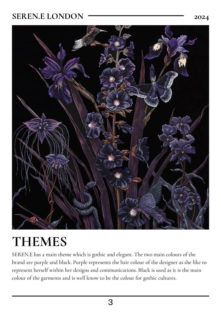
For Seren.e, our brand embodies sophistication, tranquility, and a touch of mystique, encapsulated through a harmonious blend of darker tones with light to dark purple hues. Let's dive into how the brand style guide, anchored by Chamberi Super Display Regular as the signature text, shapes the essence of Seren.e's identity.
1. Defining The Colours
At the heart of Seren.e lies a commitment to evoke serenity and elegance in every encounter. My brand style guide serves as a roadmap, ensuring that every visual element and tone of voice resonates with this core essence. The combination of darker tones and purple hues represent my brand identity since purple is the colour of Seren.e while black is the colour of the clothing.
2. Chamberi Super Display Regular: A Timeless Typeface:
Typography plays a pivotal role in shaping brand identity, and for Seren.e, Chamberi Super Display Regular reigns supreme. With its classic yet contemporary aesthetic, this typeface embodies the essence of our brand—timeless, sophisticated, and effortlessly elegant. Whether gracing our marketing materials or adorning our digital platforms, Chamberi Super Display Regular lends a sense of refinement and prestige to every communication. I chose this text as I wanted to be similar yet different to the vogue typeface.
3.. Consistency
A cohesive brand identity hinges on consistency across all touch points. From the website to social media platforms, print collateral to packaging, adherence to the guidelines outlined in our style guide ensures that every interaction with Seren.e is a seamless extension of the brand story. Consistency not only fosters brand recognition but also cultivates trust and loyalty among our audience. In the style guide, I’ve made sure that it is consistent to my theme and brand identity.
Summary
In this lesson I have learned a lot about how style guides are a must for a brand and its identity as well as how it plays a part in communications. I gained knowledge on what pictures are good and bad, how to use typography and how you can change the kerning. I now know how important it is to use the style guide as a base and where to go from to keep the brand aesthetics consistent. Consumer love to know what is behind a brand so they can trust the brand itself. I also found out how to use in design more and create better projects within the cad. In design is a good app to use for anything to do with creating fashion communications and is well known within the industry. However, I much prefer cads like canva and procreate since you can use them on any sort of technology while in design is only on laptops or computers. It is also harder to use than any other cad and takes a lot of time to learn to use. I will be using a style guide for my brand as a starter pack and to help me remember to keep consistent.


Comments